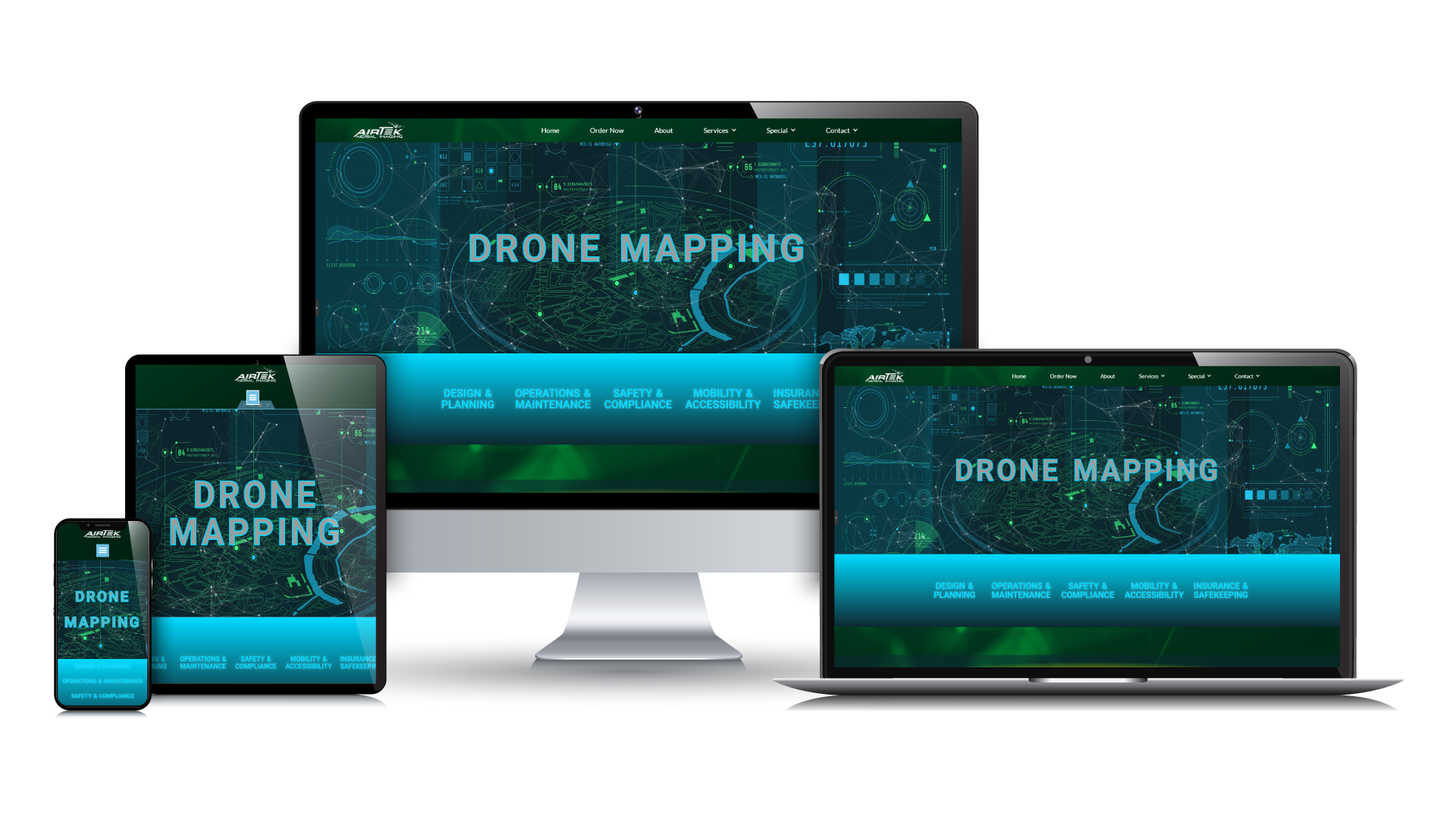
Brand Identity - Case Study - AirTek Aerial Imaging
My Role
Tools
Timeline
Motion Graphic Designer
Web Developer
Dec 2021 – January 2022
Introduction
I was approached by Kent Small, which will later become our client and the founder of AirTek. In the initial phases, our client’s name for his company was Flyby. Kent’s idea was to create an aerial drone photography company his vision is to expand the business across Edmonton, Calgary, and parts of Alberta. The company was at its very inception point and needed a brand identity—this is where we will begin our journey.
Defining the Brand Identity
To begin, I asked our client a series of questions to help us define the characteristics of his brand as it relates to the type of services he’ll be offering as well as to describe his company values. These questions help shape the personality of the brand and helps lead us into clearly defining the unique value proposition—what the company offers that the competition does not.
The Verbal Brand Identity: The Company Description
Based on the brand identity, we wrote the following new company description: We are an aerial & videography company committed to providing the highest quality services at competitive pricing, we offer a price matching guarantee to ensure customers are receiving the best price for our services. We provide a wide range of aerial imaging services. Five words that best describe the company are: Professional, Reliable, Local, Licensed, Cost Effective.
Designing the Logo
Creating the Visual Brand Identity: The Logo Development
Our Goal
We wanted to ensure that the logo was identifiable to represent an aerial drone company. I reviewed the notes and worked with our client to visualize a brand that would reflect our client’s goals and values, as well as, clearly define what type of company Flyby is; what services one may expect from glancing at the branded logo.
Our Approach
The concept that I had in mind was to have a drone in the logo represented in motion which would blend in seamlessly into the typography. I started by reviewing concepts of other drone companies as a source of inspiration, here are some of the starter concepts which provided a foundation for our development process.
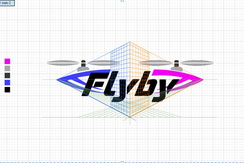
INITIAL DRAFT
My first idea was to build a drone out of the typography which I selected to be smooth with rounded edges. The goal was to seamlessly blend the typography in with the body of the frame.

CONCEPT 1
We tried several variations and felt the frame built into the lettering distracted too much from the name and didn't have the correct feel of an imaging company it also required motion effect.
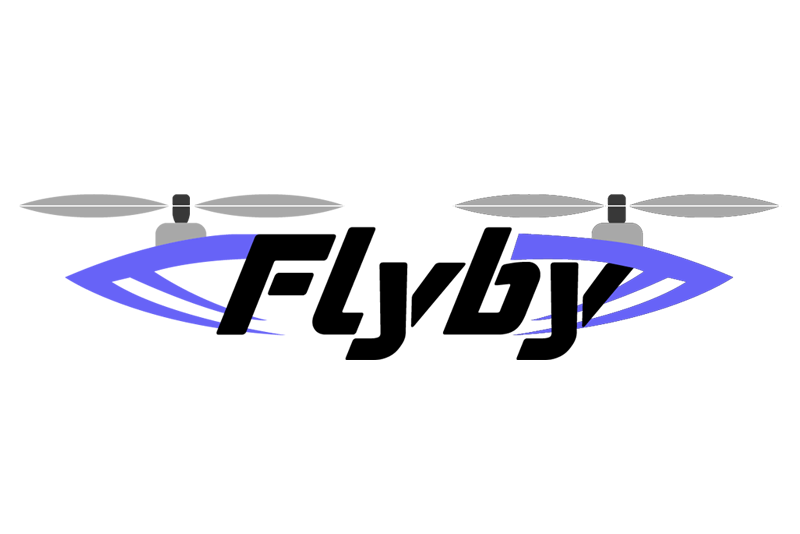
CONCEPT 2
Our revision was to tighten up the overall height and adjust the lettering to fit within the frame, this slight adjustment gave the effect that the logo and the frame were connected within the foreground.

CONCEPT 3
Our client liked the gradient motion swoosh, and the original font from concept 1. We felt the drone should be created with higher detail to look more like a drone or left out of the design, entirely.

CONCEPT 4
In our final cut, we lengthened the swoosh to wrap around the circumference of the lettering, going behind and around, to showcase a better range of motion and tighten the height of the overall logo.
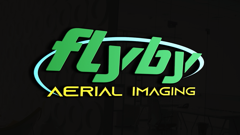
MOCKUP 1
We showcased the brand as a mockup on a black reflective surface in 3D to provide a representation of how this brand may look on the side of a company vehicle with bright contrasting colors.
An Unexpected Challenge
"Houston, we have a problem"
As I was developing a marketing strategy for Flyby I noticed that there were several well established companies with the same name; one was a drone company based out of U.K. and another was a company which ran an global E-Commerce business with a URL: www.flyby.shop. The Flyby drone company was a problem, this would affect our client’s SEO and compete with another company, offering similar services. I advised my client that this is a serious problem and could eventually lead to legal trademark issues down the road. I advised our client that he should choose a new name, and that I would work with him, to come up with a unique brand identity to maximize his SEO and marketing visibility.
Our Solution
"Good things end so better things can begin"
We considered several name changes and decided on AirTek. “Air” represented aerial service and “Tek” was related to the technical services that our client offered. Our client was even more pleased with AirTek than he was with Flyby.
The good news was a lot of the legwork for the branding was already completed in the initial development stages of Flyby. We had the basics of our new logo already completed:
- The typography
- The style of the new logo
- The colors which represented technology
The client asked me to develop a small iconic symbol that could easily represent this brand. I quickly went to work to develop a unique drone to use as an iconic symbol and then incorporated this symbol into the brand.
Final Brand Logo & Brand Icon
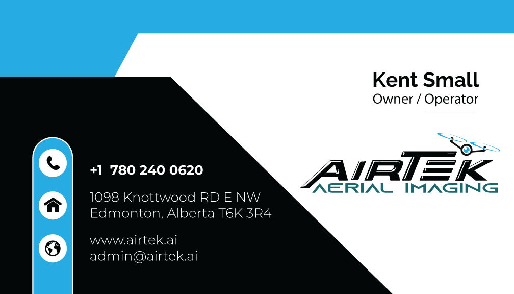

Additional Branding & Marketing
Additional Case Studies
Case Study | AirTek Aerial Imaging - Drone Mapping & Videography
Brand Identity, Full Website Development, Print Media, Digital Marketing, Social Media Development, Video Editing & Development
Case Study | Baby Best Buy
Brand Identity, Full Website Development, Print Media, Digital Marketing, Social Media Development, Facebook Ad Campaign, Video Editing & Development
